Tuesday, February 26, 2013

Illustrator CS 6 Panel Icons

All panels in Illustrator CS6 have a little icon - for when they are collapsed. Some of them also have shortcuts. It's convenient to keep a reference table with icons handy while studying by a book. For some reason I couldn't find such a reference anywhere. There is a list of default shortcuts but it's not all together and broken up into categories. So I decided to make my own.

Name Icon Shortcut               Name Icon Shortcut
Actions Shift + F7 Layers F7
Align Shift + F6 Links
Appearance Magic Wand
Artboards Navigator
Attributes Ctrl + F11 Open Type Alt + Shift + Ctrl + T
Brushes F5 Paragraph Alt + Ctrl + T
Character Ctrl + T Pathfinder Shift + Ctrl + F9
Character Styles Pattern Options
Color F6 Separations Preview
Color Guide Shift + F3 Stroke Ctrl + F10
Document Info SVG Interactivity
Flattener Preview Swatches
Glyphs Symbols Shift + Ctrl + F11
Gradient Ctrl + F9 Tabs Shift + Ctrl + T
Graphic Styles Shift + F5 Transform Shift + F8
Image Trace Transparency Shift + Ctrl + F10
Info Ctrl + F8 Variables


Yes, I didn't include Mac commands. Yes, I'm using Windows 8 and loving it, and still disliking Apple. *Gasp*. Sorry Apple fans, if you're reading this you will have to do some homework on shortcuts :)

Twitter Bootstrap and Layouts

About Bootstrap

Bootstrap is Twitter's project. It's a tool for making the life of web-developers and web-designers a lot easier than it used to be. You'd be surprised with how many websites use this tool. And why not use it? It takes care of all the tedious and annoying work out and lets you focus on what's important.
 
Bootstrap provides means to building website's layout, consistent font styles and coloring, navbar, menus, tabs, form elements, stylish buttons, and a lot of JavaScript components. So instead of starting with a white page you already have a stylesheet and a bunch of components that you don't have to write on your own or go hunt down scripts and codes and plugins.
 
Your code will be very short and very clean as most of it is done with assigning classes to html elements - like <button class="btn"> or <div class="span4">.
 
Bootstrap is completely free and open source. All you need to do is download it, and if you will be using its JavaScript components you will also need to download and include jQuery. 
 
 
Then put this on your page or header file:
 
<!DOCTYPE html>
<html lang="en">
<head>
    <title>My page</title>
    <meta content="text/html; charset=utf-8" http-equiv="Content-Type" />
    <link rel="stylesheet" type="text/css" href="css/bootstrap.min.css" />
    <script type="text/javascript" src="js/jquery.js"></script>
    <script type="text/javascript" src="js/bootstrap.min.js"></script>
</head>

And that's not all - you can actually customize the styles to your liking before downloading it.

http://twitter.github.com/bootstrap/customize.html

So you can give it the colors you had in mind for various components, widths, margins etc. However, if you don't customize it and just use it out of the box and then decide to recolor or change something it's no problem at all. You can override the css in your own file. So, just create a stylesheet.css and a js.js or what have you and put those in css and js folders and include them. Nothing new there.

Layouts

This is probably the most useful part of Bootstrap even though visually it doesn't look so exciting. If you have Bootstrap you won't have to worry about making tables or positioning divs; neither you will have to worry about browser compatibility. It's all taken care of for all the latest browsers (IE7+). Also it will look great on just about any portable device like a phone or a tablet.
 
There is a fixed and fluid layout. There are 12 columns .span1 being the smallest and .span12 being the widest. The basic code looks like this:
 
<div class="row-fluid">
<div class="span4">Column 1</div>
<div class="span8">Column 2</div>
</div>
 
Fixed layout is based on px while fluid is based on percentages and I strongly prefer that one. For fixed layout just use "row" instead of "row-fluid".
 
You can also offset columns by the width of any column sizes. Like this:
 
<div class="span4 offset3"></div>
 
This would be like making a <div class="span3"></div> and leaving it blank just to move your actual column to the right. And you can nest rows inside rows.
 
<div class="row-fluid">
<div class="span12">Level 1 Column</div>
<div class="row-fluid">
<div class="span4">Level 2 Column</div>
<div class="span8">Level 2 Column</div>
</div>
 
For fluid layout make sure that your span and offset numbers sum up to 12 since it's a percentage-based layout.
 
If you like drawing the basic look of your website in Photoshop, Illustrator, or some other program just keep in mind the layout system and make a very loose design - make the banner and other components but don't adjust it perfectly pixel to pixel. Once you have the graphics and content tie it all together with Bootstrap and show to your client - you will spend very little time on it and it will look great with minimum effort on your part. And to the client it will look like you did a lot more than just drew a picture ;)
 
I made a little bit more in-depth post at
 
Although, honestly you should just go to Bootstrap's page and look at all the things it had and lets you do. It's quite self-explanatory with some code examples.
 
I will still do more tutorials on Bootstrapping because I think that just explaining how to write a piece of code is not enough. Sometimes people need an explanation on why it's a great feature and what would be an easy approach to working with it, or what adjustments one would have to make in order to use it.
 
I myself will never make another website without Bootstrap ever. Same way as I will never do JavaScript without using jQuery. It's great for small static pages for clients that just want a web-presence without too many features and it's excellent for big projects with many lines of code. And Bootstrap will never get in the way of your own CSS and JavaScript. Go ahead try it out I'm sure you will love it as much as I do :)

Thursday, February 21, 2013

inspiRED

Lately I had so much development work to do that I haven't even touched Illustrator or anything else. So today I decided to dedicate some time to non-programming stuff and this is the result.


Working with a raster image is less fun for me than vector but it still has its place. And learning the commands for Illustrator made my life easier with Photoshop as well since some of them are the same.

Saturday, February 16, 2013

Knockout

http://knockoutjs.com/

This is an amazing and powerful tool based on jQuery. Definitely worth the time investment to study. Especially now that web stuff seems to be moving towards heavy-handed client-side and just passing everything to server through Ajax and getting it back the same way.

This together with Twitter's bootstrap will allow for building professional looking, easy to use, and easy to maintain websites in a very short period of time.

And I bet it will be just as good for windows 8 app development... that I still didn't have the time to get into.

Friday, February 15, 2013

Laziness and mistakes

I've discovered 2 things in the course of creating 2 new graphics.

1. Don't be lazy! Even if an object is the same color as the background still fill it. Sometimes when the graphic is done you will find that the background choice wasn't the best and it needs changing. Then depending on how objects are filled it will just be annoying to fix the background and fill the lines.

Also, do yourself a favor and from the very beginning create a new layer and call it background and give it some light gray or other neutral color. If it bothers you, you can always hide the layer and proceed with working as usual. And then if there are any details that will be white just make the background visible and color away.

This comic strip took me exactly 5 hours. 1.5 hours was the initial drawing and reshaping of curves. In a grand scheme of things I do think that working with a stylus (or even a mouse) is going to be faster than drawing with a pencil, especially if you know the hot-keys. When drawing on paper there is no undo-redo and well erasing is not as easy as on a computer - there are always traces left of incorrect lines.

Another thing I noticed that I was doing in a lazy way that later cost me extra time was not closing some of the shapes. While the Blob Brush is excellent and really fun to use it takes a lot longer to color with it than applying a one click fill to the object. So even if part of the object will be hidden under another one just merge the curves/lines or add anchor points were lose-handedly otherwise the straight line by which an object will be filled between 2 open ends may not always be ideal.


2. If you want a clean graphic without color exceeding the lines, and using fill rather than a brush for coloring stay away from using a brush width of which will be dependent on stylus's pressure or other variables. In this case you're not creating lines and curves anymore but closed paths that can have their own fill. It's more difficult to modify the curves and if there is any intersection it will all become one object rather than separate paths. The cat's 'outline' was essentially one path and it was not quite easy to change anything towards the end. So I ended up redrawing with a normal brush where all setting where fixed. I essentially did the drawing twice.

The pressure thing is really neat and looks good and works fine with Blob-brush fill, just can turn into a much longer process depending on how complicated the drawing is.

Just don't be lazy and if you recognize a mistake of using the wrong tool or missing something fix it right away and don't continue and hope for the best. It will save a lot of time to fix stuff from the beginning rather than suffering consequences of bad choices and prolonging the work-process significantly.

Some more graphics from earlier:

Quick and easy drawing. Blob brush. ~1 hour on everything


 Original sketch and the final result. This one was done with shapes in Photoshop. Hours of work as punishment for bad choices of tools


Stylus, Blob-brush. The original image of the gift card was too small and I had to vectorize it. Even so I spent about 2-4 hours and this was the first graphic for work done in Illustrator. The more practice the faster the process.
 

Wednesday, February 6, 2013

First steps in AI

 3rd day of studying Illustrator. I covered 7 chapters out of 31. However, in this book the shapes start in chapter 6 and Pencil, Paintbrush, Blob Brush tools are introduced in chapter 7. I got really bored and just wanted to finally make something. I had some experience with vector graphics and was pretty good at Corel Draw back in the day so I decided to put the book away for a bit and just get some practice.

I'm decent at drawing on paper and usually when I need a cartoon drawing I sketch it, take a photo, open the photo in Photoshop and basically re-create it. Yes, I'm fully aware that Photoshop is a bad choice for that but up until now I got by since I didn't do it too often. Now since I was in dire need of getting better I decided to take it to the next level, put programming aside, and study Illustrator.

The book explains tools but not when and how to use them. I concluded that shapes are great for creating cartoons. It's just like drawing - you start with basic shapes like circles and rectangles, build the graphic then tweak the curves and bring the look to senses through modifying curves. It's really neat since your shapes are perfect from the beginning and when you adjust curves it's much more precise and smooth then you would ever get by doing it with hand.

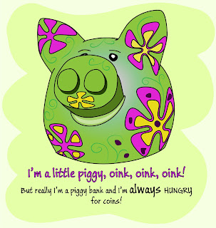
This is my piggy bank that's sitting on my desk. I used the Pencil tool (against my better judgment of using shapes). Then I adjusted the curves. All shapes are closed (except obviously the green squiggly lines). The flowers were the fun part. I made 5-hand Stars, selected all the anchor points and converted them to curves, then modified them as needed to give them the warped look as if they are on the surface. The background is done with the Blob Brush. The body has 2 fills - a solid color and a gradient in Screen blending mode. I don't really know the gradients in AI yet and I'm hoping there are more options hidden somewhere. I'm used to being able to drag the gradient wherever I want in PS which I haven't figured out yet in AI.
Then at the end of the chapter it was advised to use a stylus pen for work with Pencil, Paintbrush, and Blob Brush. Ironically, I just uninstalled the drivers and put it away. I wanted to skip over that part but as usual felt guilty for not doing every step and reinstalled the stylus.
 
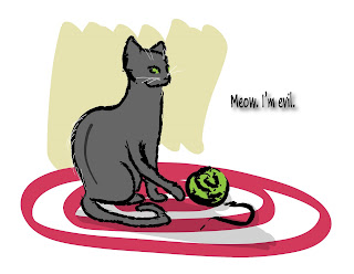
I picked one of the Art brushes for the Paintbrush tool and drew with the stylus. Takes some getting used to but It's actually really good for this kind of work. Then I switched to Draw behind mode, picked the Blob Brush and colored the cat. All of that was pretty easy and quick to do. I couldn't get the beige background right though. I must have redrawn it a 100 times and recolored it that much too.
 
I LOVE the Blob Brush tool. It's like having markers with endless ink that also don't have the overlapping lines that I hate so much.
 
And the Draw Behind mode is excellent. It's kind of like I color on the paper too - starting with the small details and slowly working my way to the background (yes I know I'm doing it backwards). But this mode is perfect for that. That feature in general is amazing and makes life a lot easier since you don't have to waste time on rearranging the objects.
 
And of course knowing the hot-keys dramatically increases the speed of everything. It is an investment of time but it pays off very quickly. I don't try to memorize everything at once but force myself to only use hotkeys for whatever I'm doing - if I don't remember the key combination I look it up in my copybook where I write them down as I cover content from the book.
 
Another time investment that immediately pays off is learning Bridge. It's as important to anybody working with graphics as source control is for programmers. I had Bridge forever but I never bothered to actually learn it until today. I had looked at it before but didn't get excited about it because I didn't know about stacks, smart collections, and the way keywords are done. Everything is within your fingertips, you don't need to manually categorize your photos/graphics and might as well just dump them in one folder, unsorted. Labels are great, too - you can mark something as Approved, To do, rejected, etc. and it will visually color-code the space between filename and thumbnail. Stacks let you group up similar photos so that only one of them shows but if you click on it you will see all the files in a stack. It's a really powerful tool - much better than Picasa or anything else I've encountered so far. And it comes free with PS or AI (nice surprise from Adobe).

Monday, February 4, 2013

Color callibrating

Some people are insane about this. I get it if one needs to calibrate the colors for printing, then yes you absolutely have to. But if your output is for web... in all honesty might as well not do anything. I mean different monitors are going to show colors differently anyway!

I'm reading a book on Illustrator and there it said you should recalibrate your monitor if you painted the walls in your office or if the lighting in the room changes... so I should calibrate my monitor a couple times a day? I mean at night it's dark you know and during the day it's bright outside... It's just ridiculous. (Also, this book had "continued on the next page" in quite a few spots. I'm surprised they didn't put "flip the page" at the bottom of every page. Despite of that, it's not a bad book just has its moments.)

Besides, if one says "oh this work looks bad because the colors are not calibrated" most of the time it's not the monitor it's the color choices. I mean if your website for instance has all the colors of the rainbow for links on a black background trust me monitor calibration won't fix it. Just deal with it yes on some monitors your art will look worse. Even Disney cartoons can look bad on a really shitty TV. Don't get paranoid about it!

Instead, spend a little time on researching color and what goes as a good color scheme and what is bad and a no-no.

Of course with color in general it's a taste thing. And most clients always know better how things will look like despite of them never having anything to do with visual arts. A designer will design a very solid webpage that looks great and the customer will say something like "no... we want this to be more lively and family-friendly so let's put magenta, lime green, red, and blue here, here, and here."

I mean there still are so many websites that when you see them you just want to stab your eyes out with a fork. But don't ever question the person's skills - it must be because you don't understand art or because your monitor isn't calibrated correctly.

I can spend hours on something really small like a new div with featured content or seasonal stuff because of colors. The code is written in 15 minutes then I have to spend hours choosing the right colors. It seems like such a small thing - just pick 4 colors for borders and backgrounds but it can take a long time to get it right. In places like that color is everything. If it's done correctly you won't even need extra graphics or what have you for it will look good no matter what. The div will stand out and will be a design element for your page in and out of itself. And that's what will get the users' attention and stick in their mind. That of course can be also said about font choices and margin/paddings but that's a different subject that I will return to at some point.

Professional books

Good books are so rare. I understand that by the time the book is written the software or technology has moved forward so much that the book becomes slightly outdated when it's finally released. Of course, a lot of times it doesn't matter that much. Most books offer additional data on their website's or blogs. And even if they don't - there are always a lot of articles on the web that will tell you what exactly changed and how it will affect your work.

But despite of this it's so difficult to find a book that's not written for beginners or intermediates. And for some reason more than any other computer literature programming books are just really heavy with introductions and dedications and unnecessary information. And it goes on for like 20 pages!

And the other thing is people writing books even for beginners always assume that their audience is not just a beginner in that language but new to the whole concept of programming in general! So another 20 pages are dedicated to loop constructs and if statements. Would be nice to just have a short syntax and maybe a short explanation if even that. I mean if a person doesn't get if else they can either a) google it or b) seriously reconsider their career choice. And sure we all have to start somewhere and beginners' books have their place. But in my opinion it would be better to have books on programming in general for beginners where all of that would be explained in detail like what classes are and what binary code is.

And there are excellent books on that subject - like Charles Petzolde's "Code: The Hidden Language of Computer Hardware and Software". That book must be the very starting point for any beginner programmer.

The other thing that really irritates me is how some simple things are explained in great detail over and over. Seriously, it's a book! Go back and re-read the first time the issue was explained if you don't get it! And then more complicated things are just explained in a couple words like oh by the way there's this thing that you can use here's one example. Next topic.

And it's so easy to pick up really bad manners from wrong books. Somebody who is new and doesn't know any better will adopt the techniques from the book and do it that way for a while. Like validation for instance. If you get a book on PHP most of the time they won't tell you that for the user's sake you should do it in javascript and THEN do it on the server-side before putting it into a database. No, if you get a book on a specific web language 99% of the time it will tell you how to do everything in that language and at best say "you could also do it in javascript but let's not worry about it right now".

I think for web-development it's crucial to give the whole package. Though the compound books that cover more than one language or technology are usually even worse. Which again goes hand-in-hand with the scarcity of books for professionals rather than beginners.

I guess what I'm saying is there need to be more books really teaching people the art of programming, the advantages and disadvantages of doing things one way or another, and listing some essential libraries and plugins. I mean seriously why would anybody in their right mind not use jquery? if you're spending 50 pages on javascript dedicate at very least a paragraph of what jquery is and that it's the way to go. It's just like at my university when we first started HTML class they were making us write things in notepad so that we would know all the tags and their properties by heart. Then next semester they gave us dreamweaver and told us to forget everything we learnt before because you don't need to know anything by heart. It's not a history class it's programming. Syntax is necessary but you can always look it up. The thing that important is to understand why and how, the abstract ideas, the logic behind it all.

Of course, it's easy to criticize others' work especially not having written any books... but it's just frustrating sometimes. Most of the time I personally use the book as a starting point for something I know nothing about and then learn through error and trial and googling the subject matter. Just keep in mind that you're not the only person in the world who ran into a question or a problem and there are a lot of forums where you may find the answers. It's always about asking the right questions. Like one of math-teachers used to say "fully understanding the problem is 50% of its solution".

Intro

I've been meaning to start a blog or a website about my work and things I encounter for a while. I was thinking of actually creating my own page where I could keep my portfolio as well but I just don't have that kind of time and for now a blog space will suffice I suppose.

This is a place for some ideas and thoughts on different subjects and matters that I deal with in the process of creating and working, be it programming, graphics, new technologies, or just anything that's within the framework of "IT". It's a big stretch but I just like doing so many things that it's hard to just stick labels to what I do.

I'm hoping this will help me stay organized with my projects and new directions, and well some time later when I read it maybe it will give me an idea of whether or not I've moved forward and bettered myself or stood in one place.

Technology is one of the roughest fields in a way that everything changes so fast that you have to stay up on your toes and keep up. Because the moment you stop learning new things you might as well go become a teacher (no offence intended... just a lot of bad programmers end up in universities teaching if statements and for loops for half a year and thinking that's what programming is about).

So, I'm wrapping up this introduction and moving on to the first real post.